
Know which scale you are reading#
TracksideRacing.AI uses two different figures:
- TSR (Trackside Rating) runs from 0 to 140 and is higher-is-better. Free members can sample the first race at each meeting and the top three dashboard runners; Basic and higher plans unlock TSR throughout the core research surfaces.
- EAPF is the advanced figure and is lower-is-better. It adjusts the performance using components such as the raw figure, track variant, ground loss, wind and weight.
The scales are not interchangeable. A TSR of 100 and an EAPF of 10 do not represent the same unit or calculation.
Use the EAPF leaderboard#
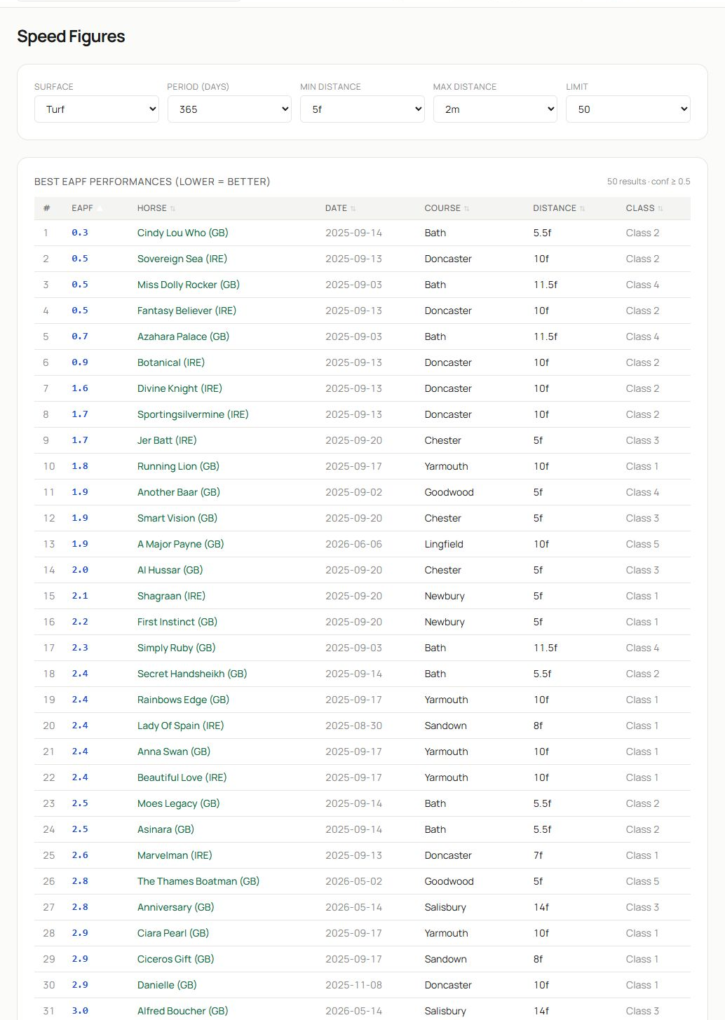
- The page identifies the list as best EAPF performances and repeats that lower is better.
- Filter by surface, time window, minimum and maximum distance, and result count.
- The ranked table shows EAPF, horse, date, course, distance and class. Select a horse or race to continue the investigation.
The leaderboard ranks individual performances, not necessarily the horses most likely to repeat them today. Check when the figure was achieved, whether conditions match and what happened on subsequent runs.
Read a horse speed sheet#
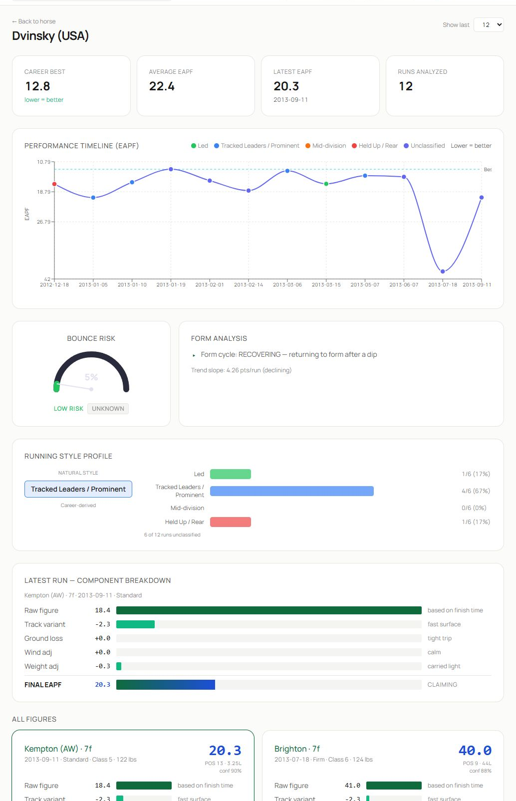
- Headline tiles show career best, average, latest EAPF and number of runs analysed. All EAPF values use lower-is-better.
- The performance timeline plots figures chronologically and colours points by running style. A rising line on the inverted axis means the number is becoming lower and the performance stronger.
- Bounce risk, form analysis and running-style profile help describe the current cycle. The latest-run component breakdown shows how the final figure was assembled.
Use the Show last control to focus on a recent window without losing the career context.
Understand component cards#
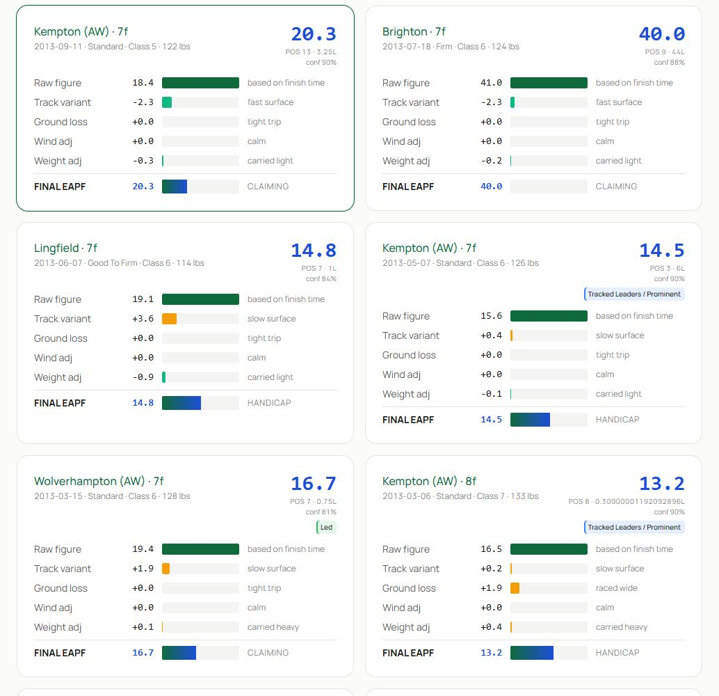
- Each card identifies the course, distance, date, going, class, carried weight and finishing position, then displays the final EAPF.
- Bars and signed values show the contribution from the raw figure, track variant, ground loss, wind and weight.
- Compare several cards to see whether a strong number came from repeatable performance or unusually favourable adjustments.
A component is context, not a reason to manually recalculate the figure. The final EAPF is the comparable output. Use the breakdown to explain differences between runs.
Read a race speed sheet#
From a race detail page or Today’s Card, choose View Speed Sheet. The grid places every runner on one row with its latest figures, best figure, cycle phase, running style and connection form. Read across one horse for consistency, then down a figure column to compare the field.
Common cycle labels describe the current pattern rather than guaranteeing the next result. A horse marked as peaking may have produced a recent best; a recovering horse may be returning towards an earlier level after a dip.
Use figures without overfitting#
- Confirm race type, surface, distance, going and class.
- Check how many runs contribute to the view.
- Compare latest, average and best rather than selecting the single lowest EAPF.
- Look for a repeatable range and note major component adjustments.
- Use cycle phase and bounce risk as prompts for context.
- Return to the racecard for draw, pace, weight, connections and price.
Data availability#
Some historical inputs are not available for every runner or race. A blank value means no supported figure is present; it does not mean zero. Screens may show an explicit no-data message where ratings are unavailable.
Related guides#
Use Race Browser and Race Details for the race sheet route, Horse Browser and Horse Profiles for the horse sheet route and Dashboard for the day’s TSR leaders and EAPF standouts.